[Lesson 8] Setting Up Your Website
Are you ready for another intense session of hard work?
Super!
Let’s start laying out the process.
The Process to Creating your Website
On the last lesson, we talked about the purpose of your site, and that you need to have it clear before starting to think or do anything else. Having a purpose is so helpful because it’ll give you clarity about the things you should include and which don’t, how to structure them, how to lay them out, and how they should look.
So, during the whole process keep your general purpose (what’s the goal of your website?) in mind, as well as the separate + particular purposes of each page.
The following steps of the process will be:
- Content
- Structure
- Page Layout
- Design + Implementation
- Evaluation

Content
List out each and every thing that you want to include on your site, and write down what you should include first:
- Think about all the things you want to communicate through your website.
- Separate your ideas and turn them into pages. For example, if you want to communicate your values, beliefs, why, and your story, then you can put them all together in your about page. And if you want to elaborate more, you could even create a blog post for each topic.
- Decide what you want to keep, and what you want to ditch.

Structure
Once you decide what should go on your website, it’s time to decide where you want it. This is when you start giving structure to your site by connecting the pages with each other according to the primary purpose of your site, and the particular purposes of the pages.
During this phase it’s important that you start to ask yourself things like:
- Is it easy for people to find your services page?
- Is it clear for people where should they go first?
- Can people navigate easily?
Then, do this:
- Start by determining the pages that will be in your main navigation menu.
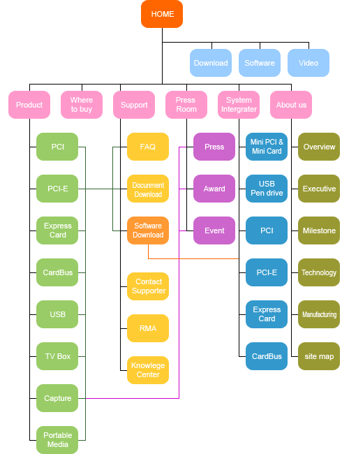
- And create your sitemap. A sitemap, as you can see in the image below, is a visual representation of where your pages will be located + how people will be able to access them. Make sure you include the must-have pages you saw in the previous lesson.


Page Layout
A page layout is how the content sections and the content itself are organized throughout the page. We’re not talking about design yet, but more generally about what goes on each of your pages + how to arrange the content, so it effectively communicates what you want with your audience.
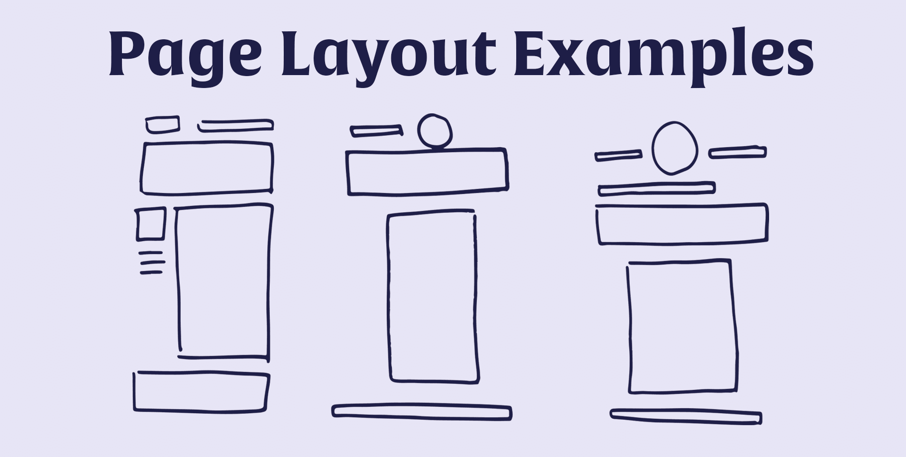
These are different kinds of layouts, but you can create your own based on your needs and your brand brief.

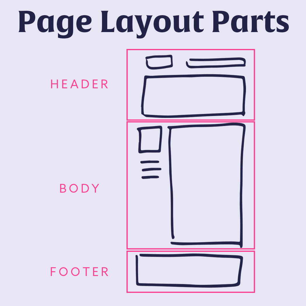
Basically, they’re divided into three main sections: header + body + footer.

The header + footer will almost always have the same information, like the headline and a great pic on the header, and some links on the footer. What will be different from page to page is the body, and to create its layout, you can do the following:
- Brainstorm and jot down all the things you want to include in one page. Think of text + visuals + multimedia.
- Discard all the ideas that aren’t relevant and don’t feel right.
- Then categorize your ideas, and divide them into sections. For example, maybe in your work with me page you want to include previous work, testimonials, who you are, your process, and the results you promise. Then, each of these points would be a section.
- Now brainstorm and write down each section’s component.
- Determine the order of each section.
- And decide the arrangement of every component of each section (visual + text + multimedia). For this last step, you can quickly sketch how you want the layout to be.

Design + Implementation
Finally, it’s time to put all your brand elements into each page (according to your layout), and actually, create each and every page from your sitemap.
Go one page by one page, so you don’t get overwhelmed. You can start with the home page, and continue with the rest of pages in the order of your navigation menu, so you don’t get lost.

Evaluation
This is something you should do at every step of the way; you must evaluate fluidity, function, cleanliness, beauty, and how well you’re making use of your brand identity + elements.
- Is your content conveying everything you want to communicate?
- Is your content clear + simple to understand by your audience?
- Is your website well structured?
- Are all pages easy to find by people, especially the most important like about, work with me, contact, portfolio, and shop?
- Are your layouts clean + simple?
- Do they look good while being functional?
- Do you have enough white space between sections and among elements?
- Are your brand elements enhancing your website and not cluttering it?
- Are your brand elements working well together?

WordPress or SquareSpace
Personally, I’ve only used WordPress, I have a background in coding + web design, so it’s always been easy for me to use WordPress. Besides, one of the main purposes of my websites is having a membership site (this one) that allows my students to login + get access to their courses, and I’m not able to do that on SquareSpace.
WordPress has a lot of benefits like tons of plugins + integrations with other platforms to help you create a website tailored to your needs in terms of design + functionality. Besides, it’s super cheap to set up, and it’s quite easy + quick to create a website on this platform. But, it has some downsides, if you’re a newbie, you maybe need to stick to the aesthetics of the theme you picked (the theme is like the layout template for all your site) or hire someone to help you with some code.
But, maybe you’re not too tech-savvy, and you want a simple and beautiful template. Then, SquareSpace is your safe bet. I’ve heard all kinds of great stuff about this platform time and time again, and I believe it’s a great option for all creatives who want to focus on doing what they’re really meant to do.
So, what platform should you choose?
Go for the platform that’s more simple to use for you.
Squarespace has a trial period, then sign up and try it out. Start creating your website there, try and evaluate the functionality + flexibility you have. Try to put yourself into a time machine and see how you’d keep interacting with this platform. Megan Minns has an amazing and super complete free course on SquareSpace that you can use while you try the platform.
If SquareSpace doesn’t convince you, then hop on WordPress. Most hosting platforms offer monthly plans at $10 or less, but you’ll need to find a theme that fits your brand aesthetics (which cost around $30-$60). And you can do the same, try the platform out, see how it is to create the pages, fill them up with your content, and getting involved in the blog back end. Amy Lynn Andrews has a great guide to setting up a WordPress. And also Bloggercasts has a series of step-by-step videos.
Evaluate both platforms, and decide what’s best for you and your needs. The time and money you invest at this moment will be so much less than changing platforms in the future, so it’s worth the try.
Now use the worksheets of this lesson, and create your website with the five easy steps described here. Then hop on the community and share your complete site, plus all questions + doubts.
Now it’s your turn!
- Read this lesson, and print the worksheets.
- Create your website + must-have pages following the step-by-step process described in this lesson.
- Then share it in the community with your questions + doubts.

