[Lesson 7] Must-Have Pages
Before setting up your website, I want to make sure you know what are the must-have pages that you can’t skip creating. These pages are super important because they help your prospective clients to:
- Learn more about you, the person behind the business, and what you do.
- Trust you can deliver what you promise. These pages help you build credibility.
- Know if you + offerings are a good fit for them.
- Get in love with what you create.
- Get educated on what’s like to work with them.
- Get ready to invest in you and your products. Yes, it means more sales and more projects closed!
So, now that you know how important it is to have these pages, let’s dive deep into which they are.

About Me
For months, this one was the latest page I wanted to create; I didn’t know what to include + say, and it felt super awkward to talk only about me + have my photo in there. But I realized three things that helped me see the importance of this page:
- It’s one of the pages with more clicks on my site.
- People want to see there’s a real person behind your brand.
- Your about me page is not about you, it’s about how you can help your dream clients.
About me page dos:
- Start with a catchy headline that speaks to them and about them. Think needs + wants (pain + pleasure points).
- Elaborate a bit more on that headline in the first paragraph (it could be short).
- Now that you have them hooked, introduce yourself and talk a bit about you, what you do, your mission, and something fun or something you enjoy to do that can connect you with your prospective clients. Remember to include a beautiful pic of yourself (you’re perfect, so show it off!)
- After this, it’s up to you what you include in your about page; it could be your story, your values + beliefs, or a more in-depth explanation of what you can do for them. Think of this as something you’d tell a friend or a friend of a friend that’s somewhat interested in hiring you or buying from you. (If you wouldn’t say it to a friend, or if you’d sound weird in real life or not like the real you, then don’t include it).
- And make sure you include an opt-in form (with a freebie) to keep in touch with your prospective clients – don’t let them go away and disappear! We’ll see all about opt-ins + freebies in the next module, so in the meantime, you can leave space for that or just know that you must include that.

Portfolio
This is a must-have page only if you have work that you loved creating, work that’s part of the best you’ve done, and work that you’ll be happy to create again and again. If you don’t have this kind of work under your belt yet, then create some exciting personal projects, and add them to your portfolio (yes, personal projects are valid too because they’re showing your expertise + talents).
Is it okay not to have a portfolio page if you don’t like the work you’ve done (for whatever reasons)?
It is, at some point. Having work that you didn’t like to do is more damaging than beneficial. If you keep showing work that doesn’t show off your true strengths + passions + talents or if you have great work, but you didn’t like the process, or the project, or the kind of client, then don’t include it – or you’ll keep attracting people who want to hire to create those lame + boring + dull projects.
So, as I said before, think of the very first thing you want to do or the most exciting project you could think of, and start creating it (or at least a small version of it), then add it to your portfolio page.
But Karen, you don’t have a portfolio page?
Yeah, I don’t have a portfolio page, and I haven’t had it in a loooong time, heck I don’t even have a website for my freelance services, but that’s because I’m not open to working with new clients. For several years I’ve only worked with current clients and a couple of referred people. In my particular case, I don’t need to have a portfolio page because those persons already know how I work, and the referred clients don’t even ask because they’re sure I’ll do a great job.
But, if you’re actively looking for clients, then yes you need a portfolio. So, add your best work; pieces that make you feel proud and happy that you created them, and kind of work that you want to keep creating.
Portfolio dos:
- Okay, now you know you must include ONLY work that you love, that was exciting to create, and that’s part of your best work. But, you should also include work that uses your strengths + passions + talents.
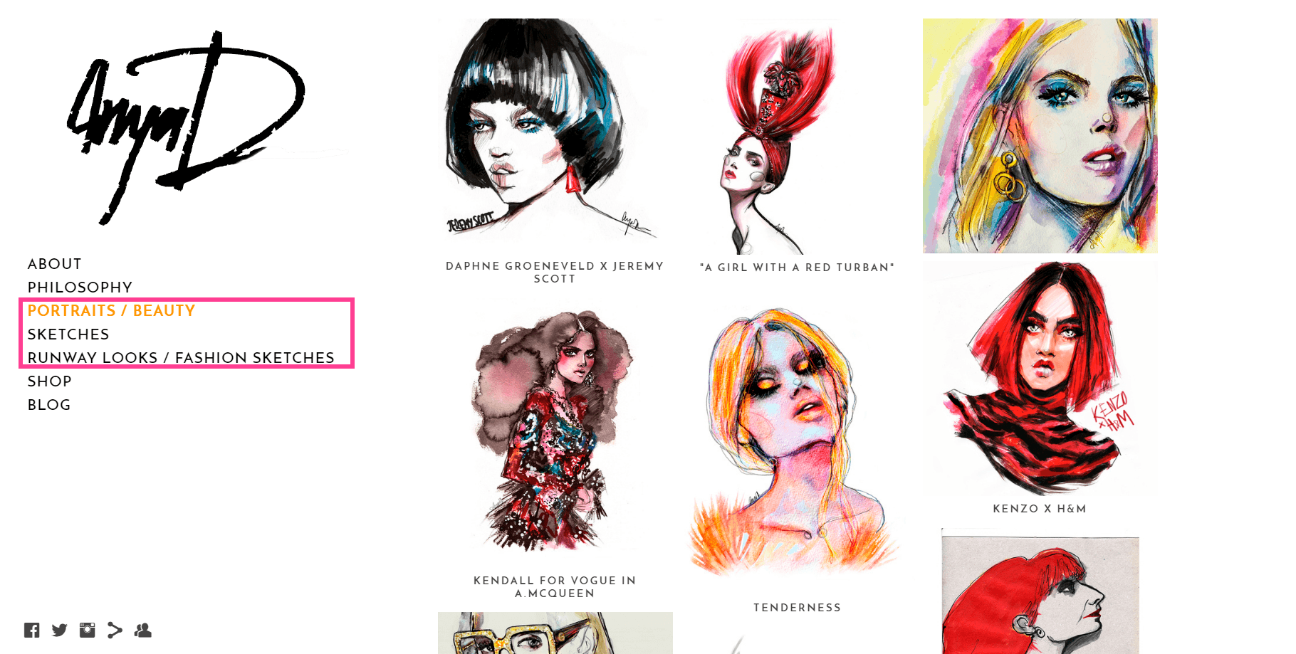
- Categorize your work. Don’t put all the pieces you’ve created on the same page; that’s confusing, and it looks unpolished. Categorize your work by type, for example, if you’re an illustrator who creates illustrations for bridal, beauty, and commercial industries, then add a secondary menu to your portfolio and include all bridal stuff on one page, all beauty stuff on another page, and all commercial stuff on another page. A great example for this is Anya Dee’s portfolio; she separates portraits from sketches and runway looks.
- A simple + clean portfolio design is better. Sometimes it’s so tempting to add all kinds of colors + imagery + things that we think will make pop up our work, but all our work really needs to pop up is itself and beautiful + clean + simple environment. Give your work white space so that it can shine.

Work with me (if you sell services)
This is a page that above all must be clear; it should be clear on:
- What you offer.
- What your offering can do for them.
- How you can meet their needs + wants.
- Explain your process, how both of you will interact together, and what it takes to have a finished project with you.
- Proof of your work, like a mini-gallery of related examples.
- Testimonials of people who’ve worked with you.
What works a lot for work with me pages is packaging your services.
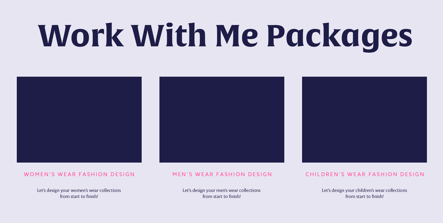
For example, if you offer fashion design for women’s wear, men’s wear, and children’s wear, then separate each category into one package with a separate page that includes the points mentioned above. This will avoid confusion in your prospective clients, they’ll feel identified (not put in a box with other types of clients), and it’ll make it easier for them to say yes.
Work with me don’ts:
- Again, this is not about you. I’ve seen countless pages of my mentees and students, and everything they talk about is themselves. People are on your page for a solution, so make it loud and clear. Tell them how their life or business will be better, speak about the benefits, and focus on the solution.
- Only having something like ‘Have a commission project? Send me an email to…’. Most people, especially big clients, want to know if you’re a good fit for them or not in the first visit to your site, they don’t want to spend time writing you an email + waiting for your response. That’s why you clarified your services during module 3, so you can explain them here. If at the end you want to include something like this ‘Can’t see what you need, but like what you see? Send me an email to…’, then that’s fine.
- Not having a work with me page. This is also very common; some creatives expect that people contact them through email or social media. But, not explicitly stating that you are available for commission work, is actually telling people that you aren’t available for work.

Shop (if you sell products)
Well, obviously this is a must-have if you sell products, but we’ll see where you should set up your shop, and some dos.
On your own site? On Etsy? Or another platform?
The last time I sold products was locally, so I didn’t need a website nor Etsy. But, now I’m launching a new shop, and I’ll include my products on both my website and an Etsy account.
Why?
Well, Etsy is a huge marketplace, it has thousands of people who are already searching for things + buying galore over there. And it can be a game changer for my new shop because people that wouldn’t find me otherwise will be able to know my products + website and buy directly from my shop in the future.
And on my own website I’ll be selling through Gumroad because I won’t have a huge inventory, so it’ll be easy for me to keep track of things. Gumroad is one of my favorite tools, I love it because it lets people buy with PayPal, credit card or debit card.
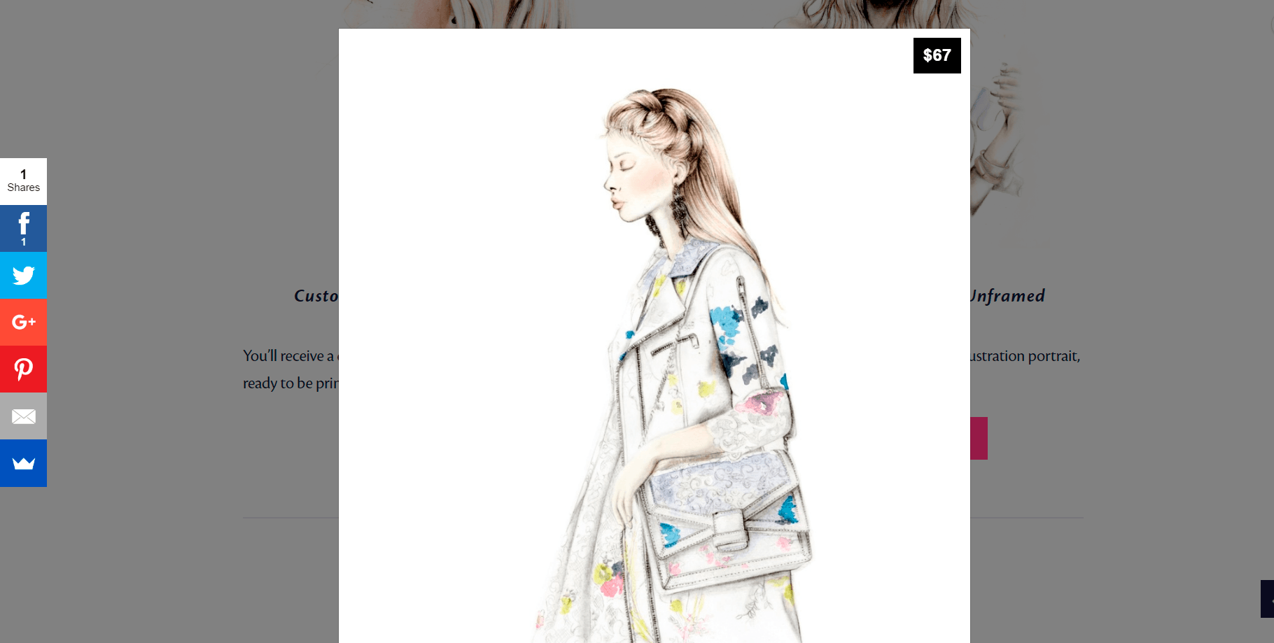
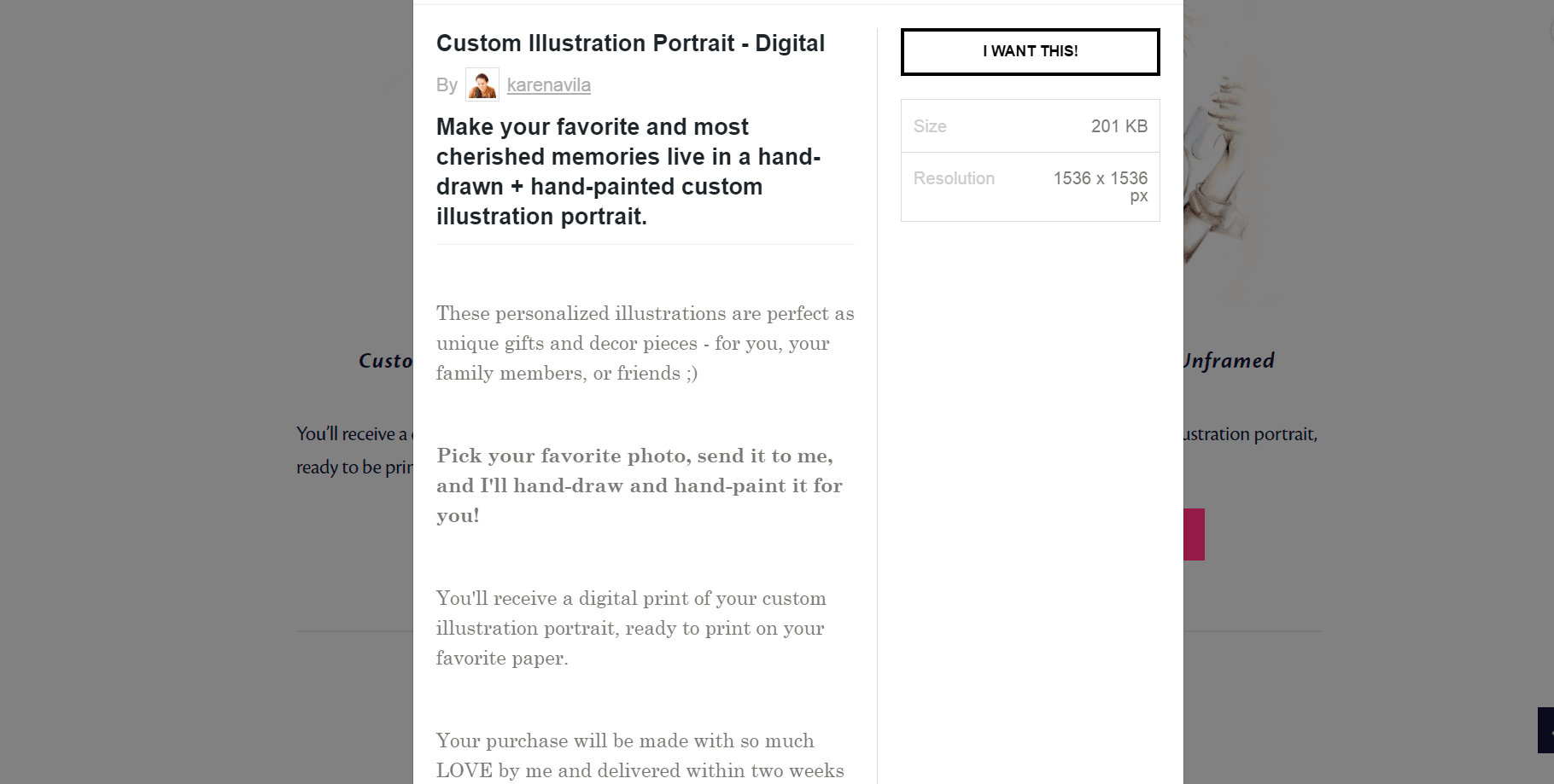
A great option when you have big inventories is Shopify. It has lots of features to make it super easy for you to maintain a shop, and for your customers to buy from you.
What about other options like Society6, RedBubble, or Casetify?
I’ve known good and bad things of that kind of marketplaces; I love how they make it super easy for artists to create their art + sell it as products, but I don’t like the super low earnings that the artists has. Besides, for products like calendars, cards, and notebooks, I want to make sure I have complete control over the production – not only for quality matters but also because I want to add something extra to the products, so they don’t look just pre-made.
Although, the one platform I can’t wait to try is Casetify, I’m aware I can’t add a lot of extra to a phone case, and theirs are beautiful + durable, so I want to give them a try.
Shop dos:
- Have beautiful + clear + high-quality photos. This is the first thing you should care about because it’s how your customers will fall in love with your products. Have pictures of your products like if they’re being used in real life, make your customers see + feel how would it be to have your products.
- If you don’t have the skills to produce this kind of photos, then go to a professional – it’ll be money well spent.
- Have clear + enticing descriptions. What are your customers buying? What’s the product made of? How is it produced? What are its measurements? How can be used?
- Make the checkout process easy. Make it super easy for your customers to buy from you; I’ve been in shops where I need to create a username + add my info + confirm my email before even purchasing a thing! I don’t like it, I just want to buy, so sadly most of the times I just close the page (unless I really want the thing :P)

Contact
And last but not least, another pretty obvious page, but I’ve known that some people have missed great opportunities just by not having a contact me page. So, if you don’t have a contact me page yet, create + publish yours.
Contact page dos:
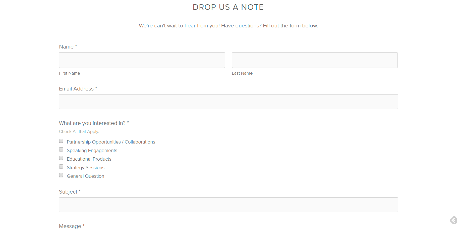
- Have a contact form. Instead of just dropping there your email, add a contact form where you ask the name + email address + subject + message + what they’re interested in (like in the following example). People most of the times are in a hurry (or lazy), so they don’t want to spend their time opening their email and thinking about what they want to say. So, make it easy for them.
- Include your email, just in case. Yes, I know some people still like to send emails, so add it just in case.
- Have separate contact forms or emails if other people take care of certain things of your business. For example, if you have an agent who takes care of licensing your work or if you have a sales rep who takes care of wholesale orders, then have a form or an email that people can use to make inquiries about those things.
And that’s the end of this giant lesson! High five! Now continue with the next lesson and get to work, because with these intense lessons you’ve got so much to do. Remember to hop on the community to share your progress + doubts + questions 🙂

