[Lesson 5] Putting Your Brand Together
This is the last lesson to create your authentic branding. You’ve already worked on the concept of your brand + you’ve turned that concept into something visual, and here you’ll make all the branding elements like your logo, typography, colors, photography, and other graphics work as a cohesive + powerful whole.
At this point, you can get the help of a professional graphic designer, or if your skills are strong in this area, then you can continue. The key here is being super honest with what you can and what you can’t do because sometimes a bunch of Photoshop + Illustrator tutorials won’t cut it. But, if you’re ready to DIY your brand, here are a few recommendations for you:
- Simple is better. It comes to anything, colors, typography, elements… You don’t want a cluttered brand, you want a beautiful + authentic brand that reflects who you are, but also that enhances + highlights your work. If your branding is all over the top, your work won’t stand out – and you need your work to stand out because that’s what people will buy.
- Check back with your mood board + keywords. Do it constantly and with everything you create. Make sure all the elements of your brand are aligned with your mood board and keywords so the whole brand is cohesive + strong + powerful.
- Get help if there’s something that’s driving you crazy. If there’s something you can’t figure it out, if your logo feels odd, or your photography is not the best, it’s totally okay to have the help of a professional. You’ve done the hard work already, and it’ll be less expensive to hire someone to take care of an element of your branding than all of it. Just ensure that the person you’re hiring understands your vision, your brand concept, and what you want from her/him.
Great, now let’s get started.

Typography
Typography adds variety to your text making it more interesting and easy to read. It helps to establish a hierarchy to communicate something more effectively. And it can also convey certain tone according to your brand keywords.
1 | Types of typography
For your new brand you will need 3-4 types of typography:
- Display typeface (the one for headlines)
- Secondary typeface
- Body typeface
- Accent typeface (optional)
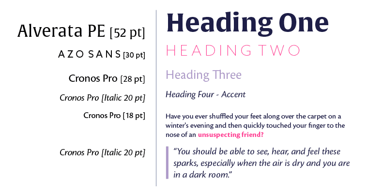
1.Display typeface. This typeface should only be used in short phrases like headlines and never in long paragraphs of text. This will be the largest font size on your website so it should set the tone for your overall brand.
2. Secondary typeface. This font should pair well with your display typeface and can be used for secondary headers or titles. This typeface is typically not used in multiple sentences or long paragraphs of text. (I usually use my Secondary font in all caps + pink, so it stands out from the rest.)
It can be helpful for navigation links or blog sidebar section titles.
3. Body typeface. This font is what you’ll use in long paragraphs of text. It needs to be legible at small sizes. And it should have both uppercase and lowercase letters. This is the font that you use for the content of your blog posts + emails + pages.
4. Accent typeface (optional). This font should get along well with the other three fonts and can be used for points of emphasis or pops of visual interest. Since you’ll use it less often, it can be a more stylized + less legible font. (like the one in my logo of Heart + Soul + me, which is hand-written by me).
2 | Where to look for them?
There are different levels of technical know-how when it comes to installing fonts, so the two places I would recommend to look for font resources (I’ve use them both) are:
For beginners: Google Fonts
Google has a lot of quality fonts that are completely free to use. The great thing about it, is that Google makes it super easy to install these fonts on any website and they explain it very clearly when you download the font.
Some themes in WordPress come with an integration with Google fonts making it super easy to use them on your site.
For intermediate level: Typekit
Typekit is an Adobe product, and it gives you access to an entire library of high-quality paid fonts for one monthly fee. I pay for Typekit under my Adobe Creative Cloud subscription (includes all programs like Photoshop, Illustrator, etc. in addition to Typekit) so basically for the price of one high-quality font I’m getting access to a whole bunch of other fonts.
Typekit also integrates with Squarespace, so you don’t have to do all kinds of complicated technical things to install your fonts. And with an easy code script you can use the Typekit fonts of your choice in WordPress.
3 | Now pick your fonts
I recommend you to follow the same steps as with the mood board exercise:
- Pick a bunch of fonts that are inspiring + fit your brand brief (keywords + mood board)
- Analyze those fonts, separate them according to type (display, secondary, body, or accent)
- And filter the fonts. Check what fonts fit best your brand? Which of them do you like the most?
- And make sure the fonts you pick work together.
- Then, add them to your brand brief.
This is the typography palette for both Fashion Step-by-Step and Heart + Soul + Me:


Graphic Elements
The graphic elements are the complementary visuals of your brand such as:
- Illustrations
- Icons
- Shapes
- Dividers
- Buttons
- Borders
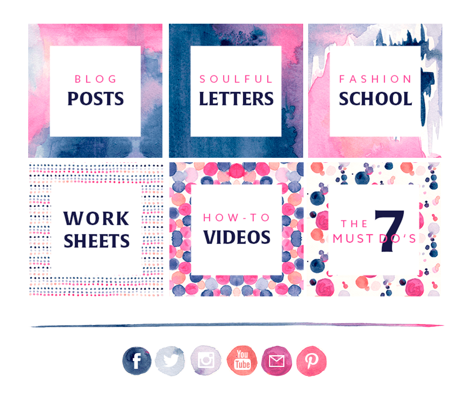
For HearSoulMe.com I haven’t created any graphic elements yet because I want the products to be the spotlight, and I also want to see how the brand evolves (maybe I’ll add some in the future). These are some examples of FSBS:

There are no rules on how many of them you create because maybe you want to have some of them on the home page as big buttons (like me over FSBS), or maybe you only want a divider and a button – and that’s okay. Just remember that the graphic elements objective is to support your logo and brand identity system without cluttering your brand, so the more straightforward + effective (in terms of communication) you create them, the better.
1 | Focus on one graphic element at a time.
Decide what graphic element you want to create, and what keyword you want to communicate through it. And play with colors + shapes to convey that keyword + tone + emotion.
2 | Assess your work.
Always come back to your mood board + keywords. Are your new graphic elements tuned in with your brand brief? Do they transmit what you really want to communicate? Are they really useful? Are they highlighting + enhancing your work, or are they making your work disappear? What can you change + improve?
3 | Repeat steps 1 + 2 as needed.
Every time you create a different graphic element try to pick a different keyword, so all your elements are balanced + aligned to your overall brand concept.
The great news about graphic elements is that you don’t have to come up with them entirely if you don’t want. There are different websites with free + paid graphics that you can use for your brand:
Once you have your graphic elements are ready, include them in your brand brief.

Logo
Before creating your logo, you need to keep in mind these things:
- Don’t follow trends. A couple of years ago the color combination of teal + coral was super in, but now it looks old and out, you want your logo to look timeless, so you’re not changing it and your branding every year.
- Don’t overcomplicate it. You don’t have to pressure yourself into trying to create the most clever or most intricate logo ever. The most important thing with branding is consistency, so if you use whatever you come up with in an authentic, thoughtful, and consistent way, that will go farther than something complicated and “clever”.
- Effective and legible is better than overly stylistic. If your logo has a really cool font but it’s impossible to read your brand name, you’ll need to get rid of it. You want people to be able to read your logo and remember it.
- Keep your maximum number of fonts to two. This is a good rule of thumb for logos, so you don’t have a bunch of different fonts competing for attention and distracting people from the actual brand name.
- Where and how will your logo be? Make sure you think ahead + envision the different places where your logo will be in. Will it be printed very small in labels or will it need to be big on billboards? Those two environments are widely different, so if you’re a business that might find itself there, you want to consider that as you create your design.
- Ensure it looks good in big and small sizes. Are there little details in your logo that will be hard to see at smaller sizes? If so, you may want to have a variation without those details.
Your logo is an important part of your brand, but remember it’s not your whole brand, so there’s no need to freak out.
Types of logos
Type-only logo (also called wordmark/logotype). This kind of logo includes a brand name using typography only (no icons or symbols.) Brands like Zara, H&M, or Hugo Boss are examples of type-only logos.
 Type + symbol/icon logo (also known as combination mark). This kind of logo includes the brand name in type PLUS some kind of symbol or icon to identify the brand even further. Channel, Lacoste, and Ralph Lauren logos are examples of a combination mark because it has both type and a symbol.
 Symbol/icon only logo (iconic/symbolic). This kind of logo includes a symbol ONLY and is typically only used by established brands. It takes a long time to have your brand name synonymous with a symbol, so I do not recommend using this type of logo if you’re starting out in your business. Apple is a great example of this kind of logos.
 How many logos do you need?
Most of the times you’ll use one primary logo, but it’s also helpful (and optional) to have a couple of other variations of that logo for other purposes.
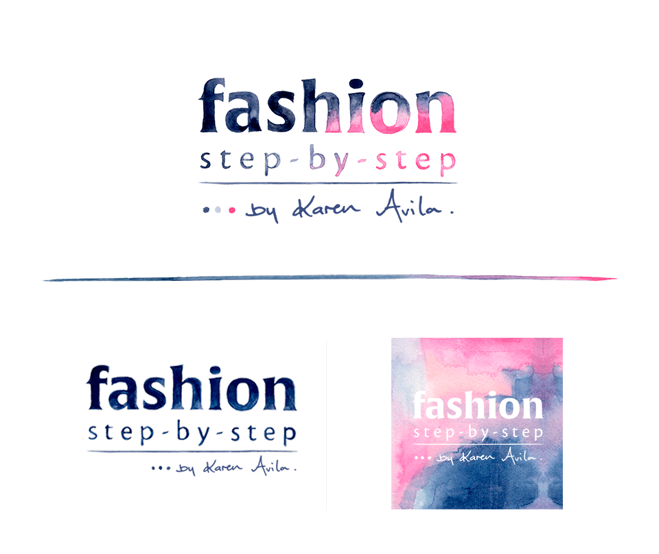
- Primary logo. This is what you’ll use 90% of the time on your website or brand collateral. It’s your go-to logo.
- Secondary logo. This is a version of your primary logo that gives you versatility for specific types of shapes. For example, if your primary logo is more square in shape, you may want a secondary logo that is more horizontal and rectangular in case you need a more long + skinny logo. Or you may want to have a circular logo for other circumstances.
- Watermark or submark. This is the simplest version of your primary logo and can be used as a social media identifier or a watermark on the top of photos.
These are the logos I created for FSBS:
 Create your logo
1. Choose what type of logo you want. My favorite kind of logos are type-only and type + symbol, especially because they won’t be a distraction from your work (which is the most important), but you can pick the kind of logo that fits your personality and your brand brief.
If you have less design experience, I’d stick with type-only. And if you’re more advanced, try to develop a logo that is typography plus a symbol.
2. Look for logo inspiration. The same way you searched for inspiration images to create your mood board, now it’s time to search for logo images that are inspiring + fit your brand brief.
You can create a new Pinterest board or a new folder on your computer, and add these logos in there. And remember to include logos that fit your keywords + mood board + brand brief + typography (because you can use the fonts you picked to create your logo!)
Then analyze the bunch of inspiration logos, and pick your top five. And jot down the following:
- What do I like of this logo?
- Does it fit my brand concept + visuals? How? Why?
- What features on this logo do I want to incorporate in mine?
3. Sketch a lot! Now that you know the type of logo and the basic components that you want to include in yours, you can have fun sketching + playing around on white paper. I always sketch a LOT of options.
And remember to look at your typography palette + graphic elements as you work on your logo development. Use these as your puzzle pieces; they’re your building blocks and tools to create something unique + authentic + ultra interesting.
4. Decide on your favorite options. Pick your favorite logos and their variations, and filter them according to the following questions:
- Is this logo inspiring to you? Would you want it to represent your brand?
- Does this logo reflect + represent your brand keywords + mood board + brand brief? Does this logo transmit the emotions and feelings you want to transmit?
- Do the logo variations work together? Are they connected to each other?
5. Pick your favorite set of logos and add color! Once you know the basic construction of your logo, you can tweak it and start adding color from your color palette to see it come to life. You can use Adobe Illustrator (my fave!), Photoshop, and even Canva or Squarespace Logo.
Oh my goodness!! Your brand is almost ready, yahoo!! Now add your logos to your brand brief.

Photography
Photography is a huge part of branding, especially if it’s product based, but even if you sell services photography is useful to:
- Reinforce your brand concept + tone. When it comes to your photography style, the main thing to keep in mind is that you want to enhance your brand tone. Is your brand minimal? Vibrant? Playful? Edgy? Whatever the case may be, your photos should align with that tone and support that emotional connection you’re trying to make with your ideal audience.
- Give your brand cohesion. Social media requires a lot of visual content, so you want to make sure that your photography is in harmony with the rest of the elements you’ve already created. This will add so much cohesion + impact throughout your branding.
- Screams professionalism. If you have a consistent and high-quality photography style, you’re able to project a level of professionalism which will help you establish credibility + trust with your audience.
I recommend going one of three routes when it comes to your photos:
- Invest in a great photographer to create a custom photo library for your brand.
- Learn photography + acquire a very good camera. This is the one I did because I love to learn new things (but photography is still complicated to me), in the future I’ll hire a professional photographer though).
- Or at least adapt pre-existing stock photos to create a consistent style.
When developing your brand photography, you must always keep in mind these points:
- Aim for consistency. Whatever tone you decided to establish for your brand, make sure you’re keeping it consistent as you continue to add blog posts + social media images + website photos, etc.
- Add variety while you keep it consistent. You may think that consistency will make your photos look boring, but actually you can play a bit with them + add variety to the mix. Just ensure that all photos fit your keywords + mood board + brand brief.
- Consider style + subject. Just like I mentioned in a previous lesson, you want to consider the style + the subject of your photos. The subject is what you see in the photo and the style refers to the attributes of the photography. Both of them can represent the same keyword + tone, or different ones. Make sure both the style + subject are aligned with your mood board + brand brief + keywords.
- Color is the fastest + easiest ways to establish a consistent look in your photography elements. How do you want and need the colors to be bright + vibrant, more monochromatic?
If you’re not ready to take the photos yourself or hire a professional you can look at good stock photography sites, over makerbook.net you can check the best sites for this.
Find or create some photographs for your brand + blog posts + social media, and determine the following:
- Are these photographs inspiring to you? Would you want them to represent your brand?
- Do they reflect and represent your brand keywords + mood board + brand brief? Do they transmit the emotions and feelings you want to transmit?
- Do the photo variations work together? Are they connected to each other? Are they cohesive + varied?
- If the answer to these filter questions is yes, keep your photos and keep creating more photographs in the same style. Then add the photo variations to your brand brief.
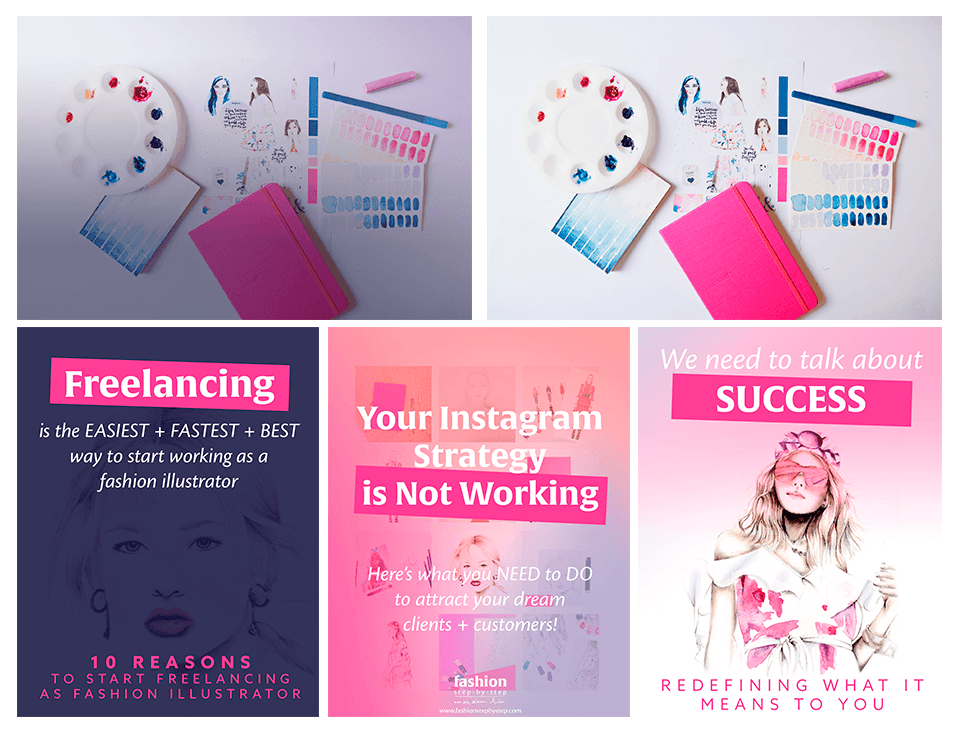
This are some examples of the photographs I’ve created for FSBS:
 And now you’re finished! Well, almost 😛 This module is quite long, and you’ve just finishing the part 1. I made it on purpose so you have time to think + reflect + experiment + implement these lessons. And then get ready for the next week because you’ll see what makes a website + portfolio + shop effective and prolific.
So, get back to work, and see you soon!
Now it’s your turn!
- Go step-by-step through this lesson.
- Create your mood board, and pick the colors for your color palette.
- Then share them in the community with your questions + doubts.

