[Lesson 4] Your Brand’s Mood Board
Yay, things are getting super fun! You’re still in the second part of your brand brief, the visual part. And in this lesson, you’ll create your mood board, and you’ll pick your color palette.
As you know, a mood board is a collection of inspiring images that encapsulate an inspiration tone + theme + vibe. And it this case, your mood board will be the same, an arrangement of inspiring images, but this time, these pictures encapsulate your brand tone. It’ll be the visual representation of your brand concept.
It’s important that you follow this step + create your mood board because:
- It takes your keywords from concept to visuals.
- It defines your brand’s aesthetics.
- It works as a compass, and it guides you through the creation of the various elements of your brand.

How to create your mood board
1 | Look for images that fit your keywords
The very first step is to find images that match your keywords. Now you have a list of features that represent your keywords (your visual vocabulary), and you can look for these features on Pinterest + Google + Behance.
My favorite tool for this is Pinterest because I can create a special board for my brand or the collection I’m working on. So, if you prefer Pinterest do the same, create a board and start pinning. Or if you want to use other tools, you can create a folder on your computer.
Include in your board or folder as many images as you want or can find. The more images you collect, the better, but make sure your images meet these requirements:
- Every image must represent at least one keyword. If it’s not related to your keywords, don’t include the image, or it’ll only dilute your brand.
- Consider the style of the picture and the subject. The subject responds to WHAT is in the visual? And the style responds to HOW is the visual represented or created? Both the style + subject are communicating something (sometimes different), so make sure that what they communicate is aligned with your keywords.
- The images must evoke something in you; they must be inspiring to you, and make you think of other connections + visuals + patterns.
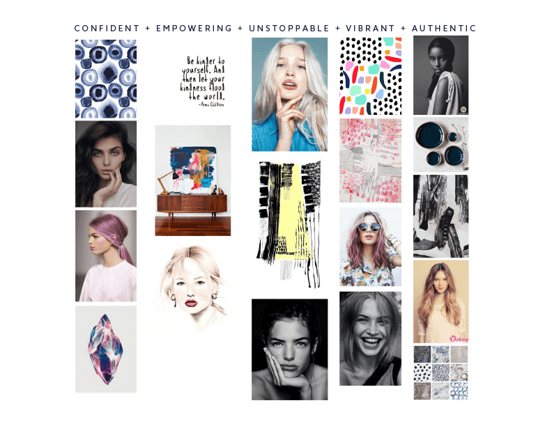
Okay, go and find as many images that fit your keywords as you can, and if you want you can accommodate them under each keyword (like in the example below). And most than anything put them all in one place like a Pinterest board or a folder in your computer, so you have the images handy + ready to use.
 2 | Analyze + filter your images
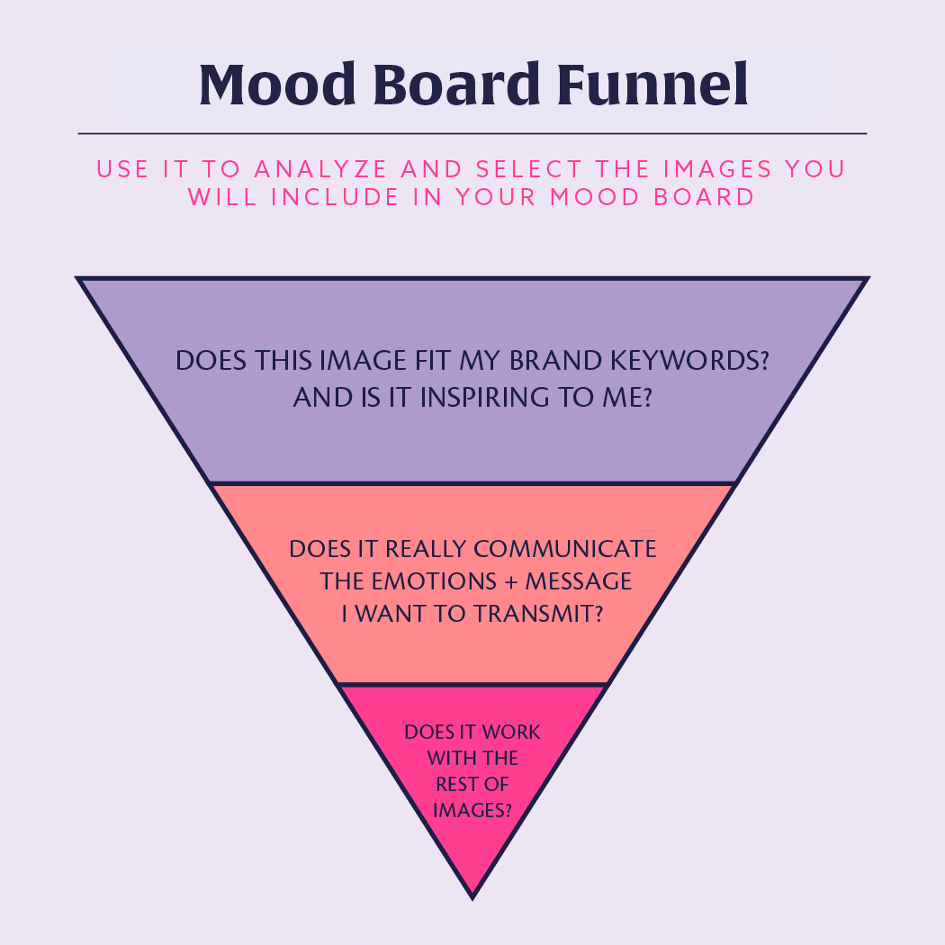
Creating + putting together a mood board is quite easy. And to make sure it really encapsulates your brand concept + inspiration + keywords, we’ll use what I call the Mood Board Funnel (haha, not a clever name I know, but it’s very helpful 😛 ). I use this funnel every time I create a mood board for any of my collections, and it’s also very useful for this other type of mood boards (the only thing that changes a bit are the questions).
I have three filters to analyze my inspiration images and ditch those that I won’t use. These filters are basically questions combined with the emotions I get from the pictures.
My Mood Board Funnel looks like this:

And the process is as simple as following these steps:
- Take one image.
- Ask yourself the first question. If the image is inspiring + represents at least one of your keywords continue to the next step, otherwise ditch it right away.
- Ask yourself the second question, can you really see the connection between this image and the emotions + message that you want to communicate through your branding? Does this image reflect what you want to transmit? If so continue to the next level, if not get rid of the image.
- Ask yourself the third question, is this image connected to the other images you’ve selected? Do they work together? Can you feel and see the cohesion among them, in colors, textures, or emotions? Again, if your answers are positive keep the image, if not ditch it.
- Repeat the process with all the images you collected.
Do the filtering again until you have 15 pictures or so.
Now you’re all set and ready to go!
3 | Build your board
It’s time to put your mood board together, and to make it effective you must consider these points:
- There aren’t arrangement rules, but you must have fun creating it. Arrange the images in a way that feel right + fun to you, or maybe in a way the whole mood board tells a story. And if you’re more comfortable using a made-for-you template, then use this – you can use it in Adobe Illustrator.
- Vary the tones + keywords that your images represent. You don’t want only one keyword to be the center of your mood board (or your brand!), instead, aim for balance.
- Avoid redundant images. If two images represent the same keyword pick your fave image and ditch the other one. But, if two images represent the same keyword and something else then you can keep them like: maybe both images are for the keyword genuine, but one is genuine + colorful, and the other is genuine + trustful.
Great, now follow these steps:
1. Choose the size of your mood board. Most of the time I create my mood boards on a letter size page because it’s easy to print and carry with me if I need to. But, I also love to create big-size mood boards because I can include lots more pictures and inspiration.
So, decide how you want to approach the creation of this mood board. Do you want a size that is easy to use, or that is more fun to use?
2. Arrange your images. I like to arrange my pictures in vertical columns with a couple of circles intersecting them (like in the template), but you can do it the way you like it + the way you feel your mood board looks better + and the way is more inspiring to you.
You can arrange your images per color, per texture, or randomly. The thing here is that the outcome reflects your keywords + the emotions you want to transmit. It’s also important that your mood board is inspiring, of course, but also that it works as a guide for you during your brand development.
3. Add color swatches to your mood board. Pick the colors based on any strong colors that are in the images – follow the steps in the next section.
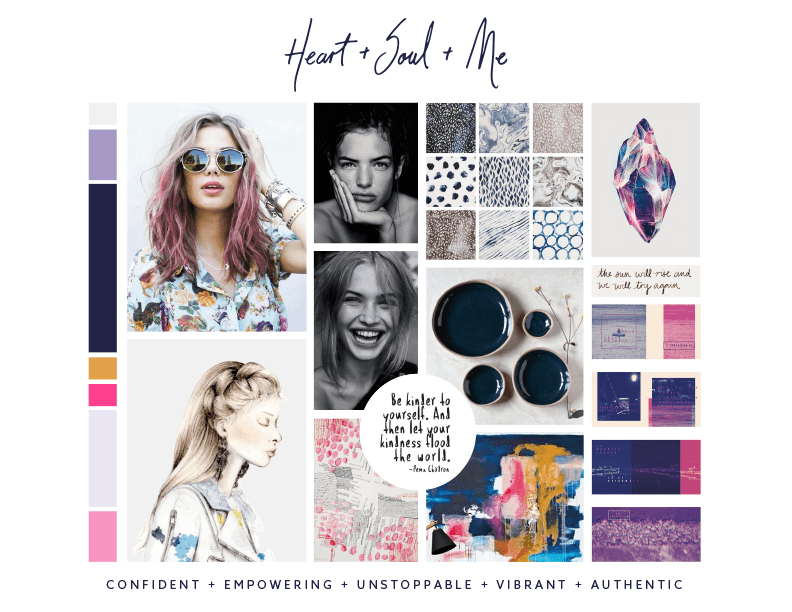
This is my Mood Board:


Choose your Color Palette
You know color conveys emotion, it’s capable of transmitting feelings + tones + emotions in a super effective way, and that’s why you must treat your color selection with care. You want each and every color to add up to your brand, make it look beautiful + authentic, but also you want it to be a highlighter of your work. So let’s pick the colors of your brand!
1 | Decide the number of colors you want in your color palette.
For your brand, I recommend having no more than five colors (tops six) as it could turn confusing the use of them. So, when in doubt go for the more simple + clean.
An easy guideline to use is the following:
- 1-2 dominant colors. These are your main colors, the ones you use most often.
- 1-2 accent colors. These are used for variety and visual interest and can provide support to your primary palette.
- 1-2 neutral colors. These neutrals can be any tone that you could pair well with the entirety of your palette. They’re often used for backgrounds or text.
2 | Pick your colors + establish their role.
You can use only one image from your mood board to get all the colors, or you can use the whole mood board to get them.
It’s easier to start picking the dominant colors and make sure they work together. Then you can continue pulling out the neutrals, and after that you can finish picking the accent colors. You must always ensure that all your colors work together to evoke the tone + emotions from your mood board. The biggest color chips are my dominant colors, the smallest are my accent colors, and the medium are my neutral colors.
3 | Arrange your colors.
The colors change according to the other colors surrounding them, so play a bit arranging the colors differently until all of them feel connected and integrated.

Assess Your Work
Now that you have your mood board and palette ready, you can use the same funnel we talked about before, ask yourself:
- Is this mood board + color palette inspiring to you? Do you feel ready and eager to start creating your brand?
- Do these images reflect + represent your brand keywords? Do these images and colors transmit the emotions and feelings you want to transmit?
- Do the images and colors work together? Are they connected to each other?
Great, once you have an inspiring mood board + color palette, you are ready to create the visual elements of your brand!
Now, before moving forward make sure you add your mood board + color palette to your brand brief. Remember you want to have everything tidy and organized in one place 🙂
Now it’s your turn!
- Go step-by-step through this lesson.
- Create your mood board, and pick the colors for your color palette.
- Then share them in the community with your questions + doubts.

